Chapter 9 | WORKS OF ART
THE IDEAL CITY

The Ideal City, presumably Giorgio Martini or Melozzo da Forlì, c. 1470, oil and tempera on panel, 67.7 x 239, 4 cm. Galleria delle Marche, Urbino
A masterpiece from the time when linear perspective was discovered is The Ideal City, painted on a wooden panel more than 2 meters wide. It is still not known exactly who painted it, but it is almost certain that the artist was also an architect. It’s a made-up city! Originally, the painting hung at eye level in a palace in the Italian city of Urbino. To the person standing in front of it it seemed as if he was looking out a window and could go for a walk across the square. It is a wonderful demonstration of skill in applying linear perspective and knowledge of architecture from the Roman period that was much admired at the time.

De ideale stad, vermoedelijk Giorgio Martini of Melozzo da Forlì, ca. 1470, olieverf en tempera op paneel, 67,7 x 239, 4 cm. Galleria delle Marche, Urbino
On the ground floor of the first buildings to the left and right we see galleries where you can always walk and shop in the shade on hot days and where you do not get wet when it rains. In the first building on the left, the top floor resembles penthouse homes with a covered roof terrace. The buildings are of different colors of natural stone and decorated with mouldings, pilasters and round arches (see also te lesson Classical architecture). All buildings are about the same height. All in all, this ideal city is perfectly organized. You can also see that perfection in the symmetry of the design: the left and right halves are almost each other’s mirror image. Of course people are missing in this design and cars, trams, bicycles and street lights did not exist at that time. All in all, it remains the model for an ideal city.

De ideale stad, vermoedelijk Giorgio Martini of Melozzo da Forlì, ca. 1470, olieverf en tempera op paneel, 67,7 x 239, 4 cm. Galleria delle Marche, Urbino
For this painting clearly a tile floor construction has been used. All buildings clearly rise above our low viewing horizon.The buildings around the square all point to one vanishing point in the middle, exactly behind the half-open door of the round temple-like building. The door is at our eye level, so we can walk right across the square and see what’s inside. Note that the curves of the central building above the horizon are different from the curves at the bottom. That’s because we view everything above the horizon (our eye level) from below.
Extra:
try to recreate the construction of this painting. First draw the frame with the correct length-width ratio and in it as lightly as possible the low horizon with the vanishing point in the middle. Secondly draw the buildings as bare blocks. The top and bottom of the buildings on either side point to the central vanishing point. For the central building, note that the curves above the horizon are different from the curves at the bottom. If that all works out, you can add your own details and color in any way you want.
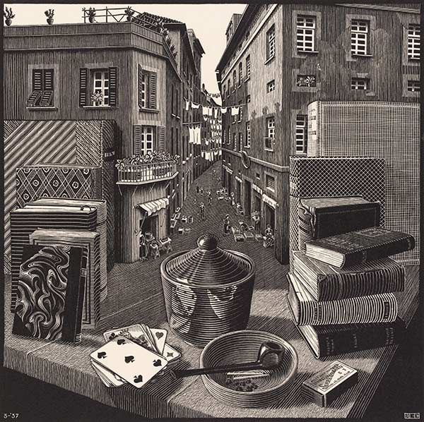
STILL LIFE AND STREET

Still life and street, M.C. Escher, 1937, wood engraving, 70 x 60 cm.
There are artists who can do magic with perspective. One of them is the famous Dutch graphic artist Maurits Cornelis Escher (1888-1972). In this wood engraving he combines a still life and a street in a special way. Almost unnoticed, the table top with the still life turns into a street with houses, people and laundry hanging to dry. Our horizon/eye level is somewhere on the first floor of the houses. The piles of books to the left and right seem to lean against the buildings. It looks real and yet it ‘s impossible.
Escher loved to play with linear perspective. In his later work he creates impossible and astonishing views in which he plays with the rules of perspective like a wizard. You can find many examples on the internet and of course in The Escher museum in The Hague.